Visualizing a nasty virus
At the time of writing the coronavirus is raging the earth. Very soon after the outbreak, visualizations of both the virus and the effect of the disease started to appear everywhere. As I partially graduated in the subject of data visualization, I have always been interested in those graphs. Lately, I followed an introduction course to visualize data with D3.js. After I completed this course, I wanted to draw some meaningful graphics with this library. So follow along when I explain a little bit about D3 and then draw a simplified version of the coronavirus molecule.
We can never know anything
When we are talking about the coronavirus[1], the first thing that comes to your mind would be: "What does this virus look like?". Well, the virus consists of a single stranded linear RNA segment. RNA, just like DNA, is a macromolecule containing genetic instructions. You are probably familiar with the double helix structure of DNA. Single stranded means the structure of the molecule has just one 'pillar' instead of two:
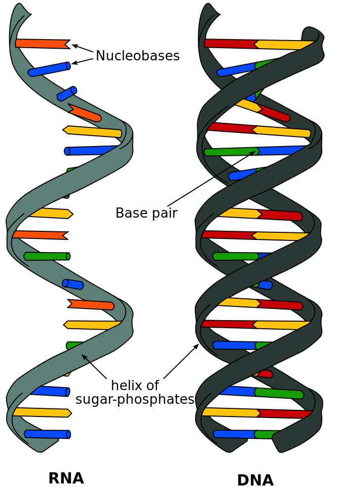
To protect the RNA, a nucleocapsid protein is wrapped around it. This capsid protein itself is encapsulated by a spherical envelope. This envelope is created by three other proteins; the membrane, the evelope and the spike proteins. Maybe it sounds a little difficult, so let’s draw the virus with D3 for complete understanding.
I am the owner of the sphere
First, let’s explore D3. D3.js is a JavaScript library for manipulating documents based on data. That’s why it’s call D3, as it stands for Data-Driven Documents. Sounds a little difficult, but you could think of this library just as a tool to create graphs for your webpage. By adding, modyfing and removing HTML, SVG and CSS you could create beautiful images.
Ok, sounds cool. But how does this work? In short, there are two steps:
-
You select some element(s) by using the W3C Selectors API
-
Apply one or more action to that selection.
Let’s try that out with a little example. Imagine you have one SVG element somewhere in a html page. With D3 you could easily select that element and draw in circle:
d3.select('svg')
  .append('circle')
    .attr('r', 45)
    .attr('cx', 45)
    .attr('cy', 45)
    .attr('fill', 'green')
As you can see, the library looks syntactically a lot like jQuery, as both use the method chaining pattern. For those not familiar, let’s examine the code. First we select all SVG elements. As we defined only one in our example, that one is now targeted by the selection. After that, we define an action to create a <circle> element and attach this to the selection. The append function returns the just created <circle> element; with the attr function we set the radius, distance and color attributes to this circle. In the end, we just draw a green circle of 90 pixels:
Armed with this knowlegde, we can easily draw more complicated figures. SVG basic shapes like lines, rectangles, ellipses and paths could be drawn as easy as above circle.
Start your own circle
As we just learned how to create circles with D3, let’s start with drawing the spherical envelope of the corona molecule. The envelope is actually the membrane of the virus, to visualize this we could draw two circles of different color on top of each other. One for the membrane, the other for it’s core. Another shorter option would be to draw just one circle with a border. The border for a SVG circle element are the stroke and the stroke-width attributes. Choosing a blue color for the fill and a darker blue color for the stroke attribute, a circle of 200 pixels could look like:
Simple can be harder than complex
Ok, that was easy. Now let’s draw the RNA. We could visualize this as just one line, going both up and down and going round. This way we expres the RNA is structured as a single helix and fits within the core. There are two SVG elements you could use to draw a line. These are the line or the path element. As the line element can only be one single straight line, we need the path element to achieve our goal. First we should create a bunch of points the line should go to:
const points = [{ 'x': 40, 'y': 100}, { 'x': 90, 'y': 36}, { 'x': 170, 'y': 100}, { 'x': 100, 'y': 150}, { 'x': 40, 'y': 130}]I just handpicked these points myself. When you would connect the points, the line would go from the west to the north, then to the east, to the south and then to the west again. To let the line wriggle 'up and down', between every point there should be extra points just above and below the direction of the line. Something like:
Because RNA is never structured perfectly within the cell, using trigonometric functions would result in a 'too perfect' wriggled line. Better to create a getRnaPoints function ourself, so we can tweak it however we want. It goes a little out of scope of this blog, so I won’t go into details of the implementation[2]. For now, let’s just say the function returns an array structered just like the one we defined ourself above, but with a lot more points available.
Now we acquired all needed data points, we can draw the shape. First we need to define a D3 line generator function:
const naturalLine = d3.line()
  .curve(d3.curveNatural)
  .x(d => d.x)
  .y(d => d.y)
This function describes when a line a drawn, how D3 should draw it. In our case, we want our line beautiful curved instead of raw edged. So I picked the curveNatural curve type[3]. The x and y functions describe where D3 should draw the points. As we don’t do scaling in this example, we can just return our defined x and y coordinates.
Now everything is in place, let’s draw the line. We tell D3 to create a new path element, pass the points into the datum funtion and use the d attribute to draw the line:
svg.append('path')
  .datum(getRnaPoint())
  .attr('d', naturalLine)
  .attr('stroke', 'black')
  .attr('fill', 'none')
How does this work? Well, the datum function just accepts an array of data. For every data element, the naturalLine function is called. This function actually calculates the points for the path element. After completed calculation, the element is created with a black stroke of one pixel.
As said before, the nucleocapsid protein wraps around the RNA. To visualize that, we could create another path shape with the exact same datum and attributes, but using a different stroke color and stroke-width. Combined, our visualization now looks like:
It grows all the time
The other three proteins are located at the membrane of the RNA molecule. Let’s start with the envelope protein. To indicate it’s just a protein positioned at the edge, we could visualize this with a small rectangle on the border of our circle. To do this, we cannot easily use the rectangle element, as it quite hard to get it just right on the edge of the circle. Whe could use the arch element though. With this SVG element you can either draw a total circle or a part of a circle. By drawing a very tiny piece of a circle, it would just look like a rectangle.
Armed with the D3 arch generator function, we can create a function to draw one envelope protein:
const drawEnvelopeProtein = startAngle =>
  svg.append('path')
    .attr('d', d3.arc()
      .innerRadius(85)
      .outerRadius(103)
      .startAngle(startAngle)
      .endAngle(startAngle + 0.04))
    .attr('transform', 'translate(100,100)')
    .attr('fill', 'green')
As we saw before with the line generator, the generator functions do calculate a path. This time however we can set the values hardcoded; so there is no need to pass data tot the datum function. To draw an entire circle, the difference between the start and end angle would be 2π. To draw a little arch, we can set the end just a little further than the start. With the inner radius starting at the border of our exising circle and the outer radius just outside of the border, this function will draw a path element over it. Because the arch function starts at 0,0 coordinates, we move the drawing to the center of our circle. Then, by calling this function thrice with a different starting angle, we could draw the envelope proteins just like this:
Deja Vu All Over Again
The membrane protein is just a little bit bigger than the envelope protein. As it is also located in the membrane as the envelope, we could use exactly the same technique to draw those proteins. The only difference would be we draw the arch both with a bigger angle and with a greater radius. If we would add ten membrane proteins evenly distributed across the circle, we would end up with following visual:
Even a tarantula considers itself beautiful
The spike glycoprotein is the one remaining protein left on the drawing board. The protein looks like a nail and gives the molecule its crowned appearance. It’s located on the outer egde of the membrane, so the proteins should be drawn outside our circle.
Drawing a nail structure sounds rather complicated, but it’s actually as easy as defining two arch shaped path elements next to each other. First we draw a rectangle as base of the nail, just like previous proteins. Then we draw another arch perpendicular to the first, by starting the angle earlier, ending later and defining the inner radius equal to the outer radius of the first arch. The simplified code looks like:
// Standing rect
svg.append('path')
  .attr('d', d3.arc()
    .innerRadius(100)
    .outerRadius(140)
    .startAngle(startAngle)
    .endAngle(startAngle + 0.1))

// Landscape rect
svg.append('path')
  .attr('d', d3.arc()
    .innerRadius(140)
    .outerRadius(150)
    .startAngle(startAngle - 0.1)
    .endAngle(startAngle + 0.2))
Now we know how to draw the spike proteins, let’s add ten proteins to the circle. To make the visual appealing properly, we could alternate between the membrane and spike proteins. In the end, we would have the following visualization:
I’ve got to say, that’s one ugly thing to behold. Let us hope this virus will soon be just a memory of the past!
There is so much more
While this image looks visually nice, I only scratched the surface with the tools D3 give you. Changing (live) data, nested SVG elements, charts, legends and animations are some topics that do deserve a blog of their own. For now, you could go to here if you want to grab the html file and read the source code.
